Migration Data in United States
data visualization / openframeworkConcept
... ...United State is one of the countries that contain the most population of immigration.Each year has so many people immigrate to United State from different countries with different races. Some are from Asia, some from Latino, and some are from Africa. Different races will also have the different number of migrants.
A dynamic data visualization to show how the different racial migrants have been changed in different cities in the United States.
Process
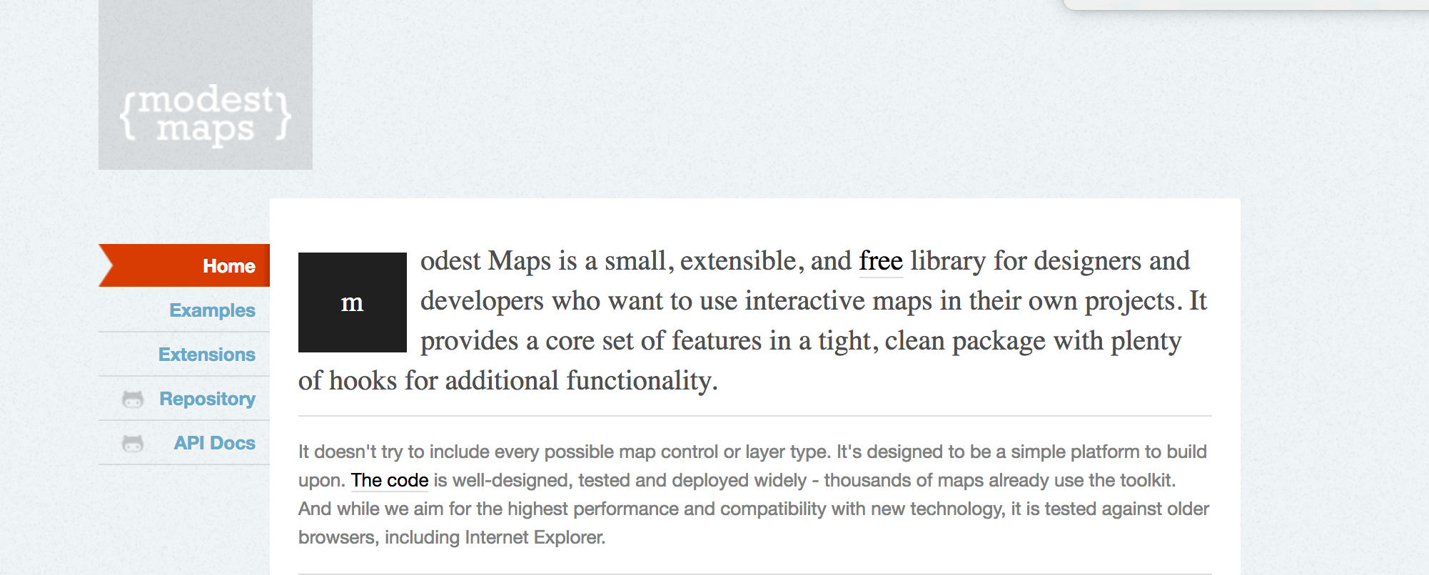
... ...A Web API ( Modest Map )
An interactive map that can provide coordinates for each of city in United State.The ModestMap provides this functionality which we can use our dataBase to point out the location inside the map.
Resource:
http://modestmaps.com/
https://github.com/RandomEtc/modestmaps-of ( The link of I how to load ModestMap to openframework )


Drawing
• I drew thousand of particles and tried to symbolize the percentage of migration population.( I divided population by 3000.) I used pink color because It was suitable for map color.
• I also used dark circles to symbolize each main cities in United States.
• The green light wave was from tutorial which I learned to allowed people to interact with the percentage of migration from different races.
Resource:
https://github.com/PetLabDataToys/Making_it_in_America_API

